Engineering story · Our own website
Accessibility engineering starts with our own website.
Before we offer WCAG 2.2 AA work to clients, we apply the same method to synque.hk — a page with motion, canvas graphics, a bilingual switch, dark and light themes and a custom inquiry form.
Before82
After100
11 October 2026
Why our own site first
A difficult page is a better proving ground.
synque.hk is deliberately visual: animated backgrounds, moving text, 3D effects, a retro-style inquiry window and a signature pad.
Those are exactly the features that break accessibility — invisible focus, motion that cannot be stopped, decorative graphics read aloud, controls with no name, faint text.
The goal is not to remove the brand. It is to make the brand work for everyone.
What we changed
Fixed in the product, not added as a badge.
- 01
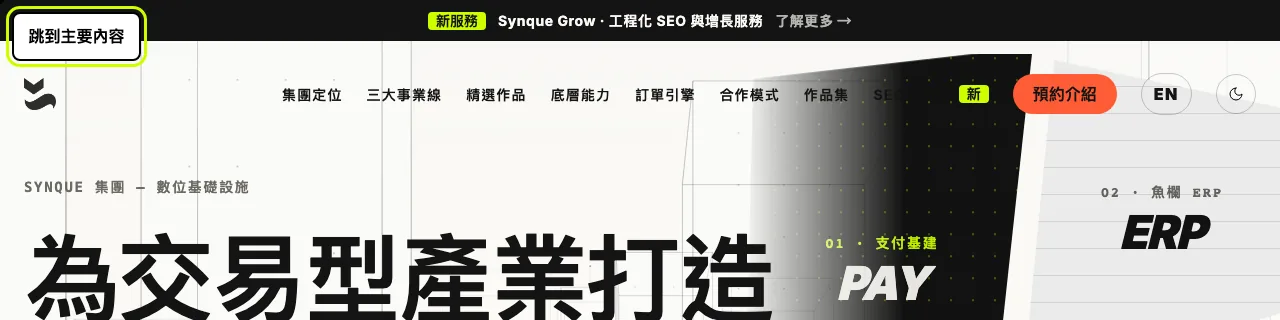
A “skip to main content” link and a main landmark
- 02
Page language follows the English / 繁體中文 switch
- 03
Menu, language and theme buttons announce their name and state
- 04
A visible focus ring on every control, in both themes
- 05
Animation stops when the visitor asks for reduced motion
- 06
Decorative canvases and giant background text hidden from screen readers
- 07
Mouse-only hero tiles turned into real, keyboard-reachable links
- 08
Every form field labelled; one clear announcement for sending, success and errors
- 09
Faint labels darkened to at least 4.5:1 contrast
- 10
Pinch-to-zoom re-enabled on mobile
Results · 11 October 2026
Measured, with the date.
Each check below was run on the updated homepage. The table says what was checked, how, and what is still to do.
| Check | Result | How it was checked |
|---|---|---|
| WCAG 2.2 A/AA automated rules | Passed — 0 violations | axe-core, light and dark theme, desktop 1280px and mobile 390px. |
| Lighthouse accessibility | Passed — 100 (was 82) | Google Lighthouse, desktop, before and after the changes. |
| Keyboard only | Passed — 40 of 40 | The first 40 Tab stops: every one reachable, with a visible focus ring. The skip link comes first. |
| Zoom and reflow | Passed | No sideways scrolling at 320px (400% zoom) or 640px (200% zoom). Pinch-zoom allowed. |
| Text spacing | Passed | WCAG 1.4.12 spacing forced on the page: no text cut off. |
| Colour contrast | Passed — 0 failures | axe-core contrast rule in light and dark themes, after scrolling the whole page. |
| Screen reader | Partly verified | Automated: every control and field has a name; one main landmark, one H1. A manual VoiceOver and NVDA pass is still to do. |
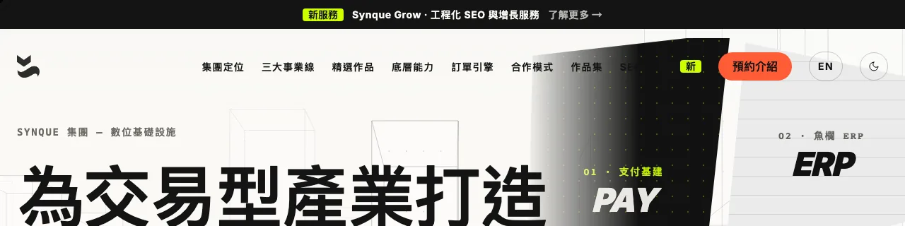
Before and after
The first press of the Tab key.
What carries into client work
A repeatable method.
- Design: contrast, focus states, target sizes and reduced motion are specified before build.
- Build: semantic HTML, keyboard operation, labelled controls and correct page language.
- Check: automated scans in both themes and at phone width, on every release.
- Verify: keyboard, zoom, text spacing and screen-reader testing by a person.
- Hand over: what passed, what is still open, and the date — not just a score.
What this page does not claim
Automated tools find many problems but cannot prove a site conforms. This is an engineering record, not a certification or legal opinion, and synque.hk is not yet claimed to conform fully to WCAG 2.2 AA — the manual screen-reader pass is still to do.